Making sign-in disappear for 120M people.
Klarna is a publicly listed company, so specific figures and unreleased screens can't be shared here. Numbers are rounded, and the screens shown are from the live product with personal details blurred. I'm happy to walk through the work in more detail in conversation, within what I'm able to share.
I was responsible for...
- Leading design for passkeys and the framework for authentication
- Running the UX benchmark of passkey experiences across industry leaders and our closest competitors
- Leading design for account linking and Sign in with Klarna for major partners
- Co-leading the MyKlarna redesign, where I owned personalisation and third-party connections
- Benchmarking, flows, prototypes and UX strategy
- Presenting design direction to stakeholders up to CXO and CEO level
I lead design for passkeys and Klarna's authentication framework, a launch expected to deliver eight-figure annual savings. I also led design for account linking and Sign in with Klarna for major partners, and co-led the redesign of MyKlarna, where people manage their account.
• • •
Project objectives...
Sign-in is the doorway to everything Klarna offers its 120M users. The goal was to make getting in faster and safer at the same time, and to keep people signed in across Klarna and its partners.
• • •
Klarna is a publicly listed company, so specific figures and unreleased screens can't be shared here. Numbers are rounded, and the screens shown are from the live product with personal details blurred. I'm happy to walk through the work in more detail in conversation, within what I'm able to share.
I was responsible for...
- Leading design for passkeys and the framework for authentication
- Running the UX benchmark of passkey experiences across industry leaders and our closest competitors
- Leading design for account linking and Sign in with Klarna for major partners
- Co-leading the MyKlarna redesign, where I owned personalisation and third-party connections
- Benchmarking, flows, prototypes and UX strategy
- Presenting design direction to stakeholders up to CXO and CEO level
• • •
Project Details...
Passkeys rollout
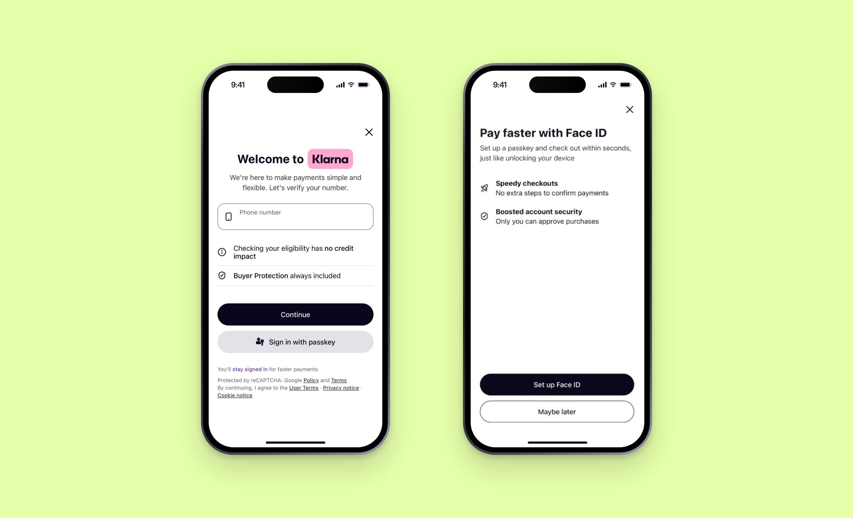
I led the UX for Klarna's move to passkeys, from benchmarking on mobile and desktop to flows, prototypes and the overall UX strategy. The aim was a passkey experience that stands up against the best in the world, balanced against stakeholder requirements and technical constraints.
A vision you can say in one breath
The feature vision fitted into a single sentence: bring as many people as possible onto passkeys without costing a single purchase, then make every sign-in after that faster and harder to abandon. That simplicity did a lot of work. Anyone on the team could hold a design decision up against it and know within seconds whether it belonged.
It also set the psychology of the design. Nobody arrives at a checkout wanting better security. They arrive wanting the thing in their basket, and anything placed between a person and that goal is felt as a cost. So a passkey has to be offered as a gain and never as a toll: one clear choice, in plain words, at a moment when the promise of never doing this again is at its most appealing. The reward comes later, every time sign-in takes a glance instead of a password, and each of those small wins makes the habit stronger.
Bring as many people as possible onto passkeys without costing a single purchase, then make every sign-in after that faster and harder to abandon.
Benchmarking the leaders, and learning from their pitfalls
Before designing anything, I ran a UX benchmark of passkey experiences on mobile and desktop, covering industry leaders and our closest competitors. I went through each one as a customer would, from creating a passkey to signing in with it, and recorded where the experience carried people forward and where it lost them.
One pitfall stood out above the rest. Many platforms use a QR code to let people sign in with a passkey saved on another device, and then show that same QR code to someone who is already on their phone. Nobody can scan the screen they are holding. It is a dead end at the exact moment a person has decided to trust you, and several of our closest competitors had fallen into it. Avoiding it became a hard requirement for our design: on a mobile, the way forward has to stay on the device in the person's hand.
Testing what a prototype can't fake
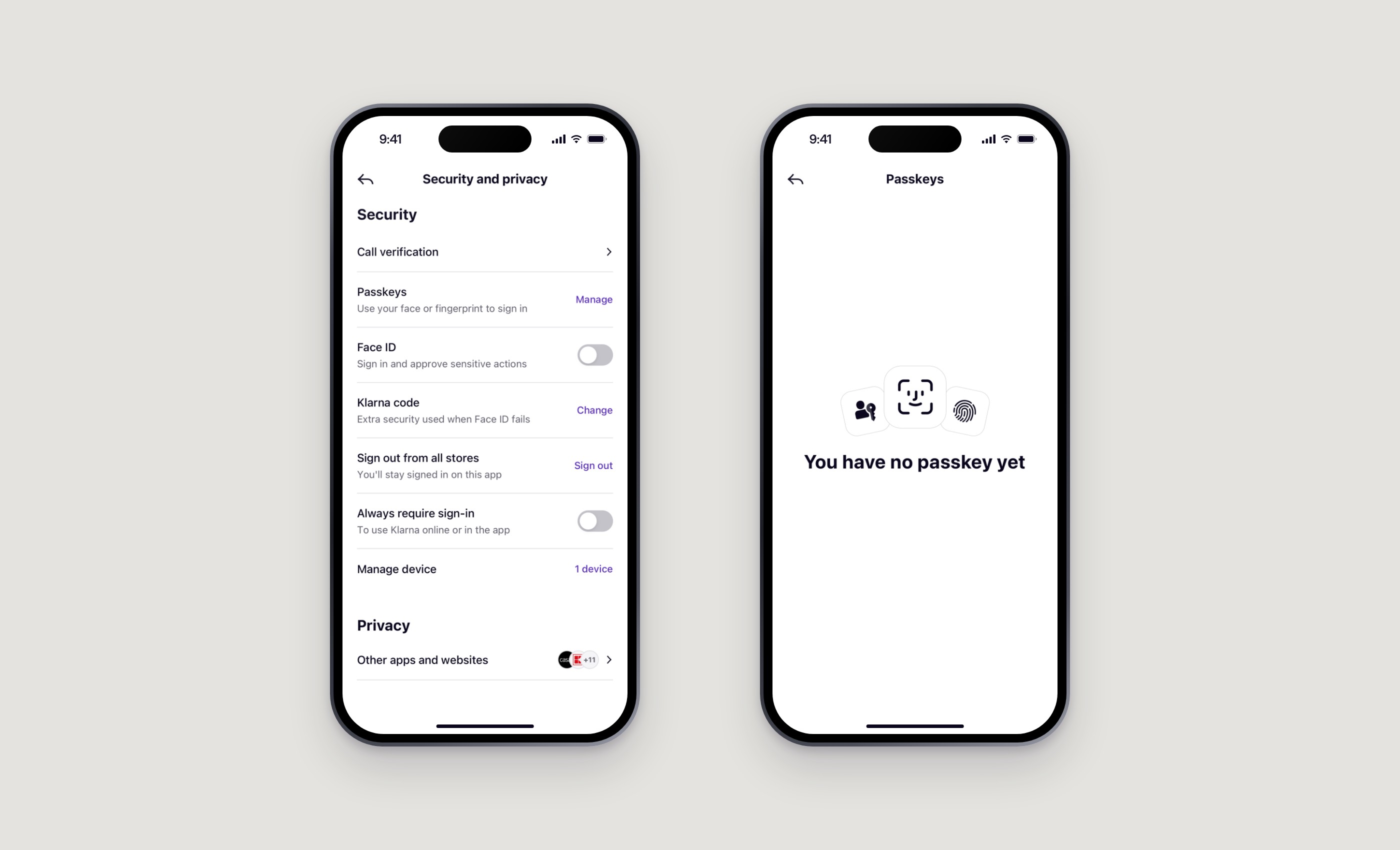
Passkeys are hard to test. The moments that matter most belong to the operating system and the browser: the system sheet, the face or fingerprint prompt, the password manager a person happens to use. A design prototype can't reproduce them faithfully, they behave differently from one device and browser to the next, and a person in a test session never behaves quite like someone who is trying to pay.
The simple vision is what made testing manageable. It gave us two questions to answer. Are more people choosing a passkey without purchase conversion dropping? And are their later sign-ins faster, with fewer people giving up along the way? We used FullStory to see how real sessions played out and where people hesitated, and we leaned on a lot of internal AI tooling to move quickly from what we saw to what we tried next.
Expected impact: eight-figure annual savings, from reduced costs and improved conversion rates.
App handover as an authentication method
When someone is partway through a purchase on another device or in a browser, the Klarna app can do the sign-in for them. The purchase hands over to the app, a saved passkey and a fingerprint confirm who they are, and they land straight on the payment review step, ready to confirm and pay. There is no password to remember and no code to copy across.
Account linking: staying signed in
I led the UX for keeping people signed in with merchants through a linked Klarna account. It meant working through hard technical and usability problems, weighing security and legal risk against business goals, and making the result work for every type of merchant.

Impact on sign-in conversion: Confidential
Sign in with Klarna for major partners
For Klarna's largest partners I designed the account linking experience inside their own bespoke integrations: account creation, login, the link itself and how people manage it afterwards. I worked directly with the partners' designers and with Klarna teams across three domains.


MyKlarna
Together with Klarna's central UX team, I co-led the redesign of MyKlarna, working with stakeholders from individual teams up to CXO and CEO level. I owned the personalisation sections and third-party connections, and improved how people manage their name, display name and account details. Incorrect account information was behind a share of rejected purchases, so making it easy to keep details right matters to people and to the business.


• • •
Applications Used
Applications Used
Figma for design concepts and prototyping
Claude Code for working prototypes
FullStory for seeing how real sessions play out
Internal AI tooling for moving faster from insight to the next iteration